

Making Custom Dice
Yesterday, we received our first look at the custom dice that we are having made for Lucidity later this year. We hope you agree with us that they look great! Since we have learned a lot from the process, we thought it would be worth sharing those things with you, in case you are planning to make custom dice in future.

So, the things we learned were:
The Order
Every copy of Lucidity has 72 (or 80, depending) dice. Those are an equal mix of four colours, representing each type of nightmare players encounter in the game. Each of the colours has its own unique mix of icons, and each icon is unique.
We ordered ~2500 dice to be split up into prototype copies to be sent out to reviewers, and agonised for weeks over the individual icons. (Below this post, I have detailed out our icon design process, in case you are interested.)
After a lot of consultation with industry experts, we went with LongPack Games for our dice. They’ve done custom dice for things like Heroes in the past, and had an incredible sample pack. They have also been very good with communication and establishing what we were after.
We had a couple of choices (many of which I detailed in the Prototyping 101 post on this site and were sort of a lesson #1 for us). In short though, we could engrave dice (costly for such a huge volume), or create acrylic or resin molds. Resin molds are much cheaper, but the dice are individually almost double the price of acrylic molds. Acrylic molds are very expensive, but the dice are the cheapest possible. (In numbers, we would need to produce ~900 copies of the game to break even on the two.)
Since we wanted our dice to send to reviewers, we went with resin molds based on a few points:
- The molds would be completed, and we could use them on our final run if we just barely made our funding goal.
- The molds were not that expensive, so if there were issues we would likely be replacing them with acrylic molds after raising funds.
- Resin molds take less time to produce, so the dice would be in our hands quicker.

We prepared our final icons as carefully as we could, putting each collection of dice icons into its own folder, using a labelling system for the files to enable the factory to produce the dice without any mixups, and yet…
Communication
There was a bit of a mixup in communication between our manufacturer and the factory. Because the volume was so low (lesson #2: 2500 dice is considered “very low” in production terms), the factory assumed we would want the dice engraved instead of cast in resin. Because why would we waste money on resin molds if we were never going to use them again? Of course, they didn’t know that we wanted to do just that.
As you can see, there is a bit of “drift” on the icons, due to (a) how the machine that engraved those icons holds the dice; and (b) how big the dice were (only 12mm each). This was due to the engraving process, and we have been assured would be fixed with the use of a mold.
So lesson #3 is that even if you do everything right (and I stress, so did our manufacturer), there can still be miscommunication based on assumptions! We had a few options at that point, but we have gone with what makes the most sense right now: take what has already been made and sort out the quality issues in the meantime. We’ll be going through those 2500 dice and putting aside the ones with significant errors so that reviewers only see our ideal version of the game! And the misprints? Maybe we will give them away!
We have to prioritise, and our first priority is timing: we want to get the dice into our hands early for reviewers to have time to make the reviews. Our second priority is quality: we want the dice to be as good as possible for first impressions. Based on what we learned from lesson #3 though, we will be factoring in an extra month to our manufacturing estimates to factor in any miscommunication post-campaign.
The Artwork
There are some widths that have interesting (some positive, some negative) consequences. The two icons I would like to draw attention to are:
 Hunt: A goat’s skull, which resembles flames when held upside down.
- Points: A crescent with grasping tentacles surrounding a numeral.
![]() Can you guess which areas were going to be problematic on each?
Can you guess which areas were going to be problematic on each?
On the Hunt icon, the area in the top (around the curve of the horns) was surprisingly fine. We had expected issues there, but it worked out perfectly. However, the area around the skull’s cheeks was not so lucky! As it turns out, that area was too thin, resulting in paint overflowing onto the surface and no clear line. By happy accident, this looks amazing. The white paint fills the gap, but the raised texture effect remains. This adds a nice 3D quality to the skull.
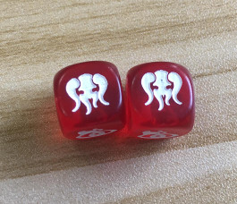
On the Points icon though, the thin spikes at the top of the crescent did not work out so well. Because the artwork was so fine up there, and the dice are so small (12mm), the paint (in some cases) did not fill the spikes all the way up. You can see that below on the left-hand blue (1) and the right-hand red (2).

So lesson #4 is that for small dice, thin details do not work (but sometimes, like with the skull, not working actually works out nicely).
We are discussing whether to increase the size of the dice in the final game from 12mm to 14mm, or whether to blunt the ends of the crescent to avoid this discrepancy in future. Either way, it is nice to see our icons applied to the dice, which brings me to the final point…
Sometimes You Just Have to Take a Leap of Faith
For me, lesson #5 is that sometimes you can’t know how well something will work out until you do it. Sometimes you just need to dive in and get the experience first-hand. In this case, I am really happy with the results, even though we will need to do a bit of QA on some of them. What will go to reviewers will be a great representation of what Lucidity will look like. Meanwhile, I have fancy dice to use for demonstrations at conventions.
The colours look great, and we have the examples now to modify them slightly to improve the distinction between the yellow and green for those with red-green colourblindness (the green and yellow both look brown, though they are distinct enough to be obvious – it would be nice to make them a little more obvious).
Of course, this is all still an ongoing process, and we will be commissioning actual molds for the final dice. (You can be assured that by that time we will have resolved these issues completely and be ready for any others that might occur!)
The Icon Design Process
This was really secondary to the main point, but it might be interesting to see progress on those icons over time.
 Our first online icons (for the Tabletopia demo) were from game-icons.net which is a fantastic resource for iconography in games. I highly recommend looking there when you are starting. They have really nice, clean, clear at any distance, icons that are made freely available under a Creative Commons license.
We used a bleeding eye to represent our Shadows, a moon to represent our Exhaust, and gnashing teeth to represent our Hunt. The points were represented using numbers.
Our hand-made icons (drawn onto stickers placed on the dice) were a little different! They had to be simple to draw 400 of quickly, but recognisable when they started to smudge. Our initial design needed to be modified as the Z we used for the Exhaust was often mistaken with the 2 we used for the 2-points. The second batch we made used a crescent moon next to a Z to distinguish it from the 2.

 When it came time to make the icons for the final dice, we went through a couple of different ideas. We wanted an eye-catching eye with smudged mascara as the main Shadow icon, which was the focus of our design.
For the Hunt icon, we actually started by looking on game-icons.net again for inspiration, then tried drawing teeth like an orc is usually represented with. Eventually, we started playing with the idea of teeth that also looked like flames and, through that design process, created the goat skull.
Scanning in those pages, we used the GIMP to lay out the icons. The Shadow icon didn’t change at all, while the Exhaust, Hunt and Points symbols had a couple of different options. We sought feedback on a number of artist groups and slowly made improvements to the design over time.

In this first iteration, you can see how we were already thinking about placement of shapes, widths, etc. The reason the Points and Exhaust all had circles around them was so that players could not feel out the inset symbols by touch – drawing dice from the bag must be random!
Comments were generally positive across the board, but the thinness of the Hunt icon’s nose and the line around the Exhaust was commented on. We also noticed that the Shadow’s secondary smudge mark looked odd and didn’t fit the curve of the main smudge mark (so we fixed that, and increased the eye dot so it would mold clearly). We redid the icons and, this time, did some photo-manipulation magic to see how they would look on the dice.

In the second run-through, we used the symmetry that people loved about the Hunt icon’s horns, but many commented that they loved the weirdness that came from the asymmetrical horns. So we applied that to the nose, resulting in a symbol that (upside down) looked more flame-like than lotus-like.
Now that we were getting down to the fine details, the comments started changing. Primarily, people pointed out that the symbols were all very asymmetrical, except for the Exhaust. The moon was too even. The points also were too even.

So the Exhaust worked under the latest revision, with asymmetrical moon and zZ instead of Zz balancing the icon better. We also tried something radically different for the points, based on an artist’s suggestion. Like King of Tokyo, using icons instead of numbers would unify the pieces.


But after countless tries, nothing seemed to fit. They looked like ninja stars, or swastikas, or eyes, or starbursts. The theme didn’t make sense (perhaps footprints would have represented escaping Nightmares better). And why did we replace the numbers anyway?

One of the designs we rather liked was eyelashes like tentacles. It didn’t work thematically, and people thought they were fronds, but it inspired the crescents that ultimately surrounded our numbers.
We went back to using numbers, customising a font and adding reaching shadows to fit the theme better and to give it that unified curve such that players could not sense which dice was which by touch alone.

Our final icons looked great and, as you can see, we think they translated to the dice faces really well!
Now we just need to work on colour: making those greens a little yellower and a lot darker, adding some brown to the yellows, and darkening the red a bit more.
You must be logged in to post a comment.